I call it iron chef web design.
When you need to get a new site up as fast as possible.
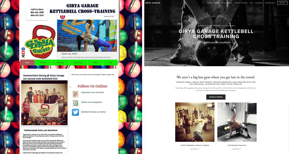
Last weekend the small gym that my husband and I go was featured in a large local event that attracts thousands of potential clients. But they knew their current site wasn’t doing them any favors. (side note: I adore them and they’ve given me permission to talk about the rebrand on my site).
They recognized that their old website was detracting from their great services.
It was out-of-date, hard to use and most importantly not clear on what they offered.
Seven hours, two stock photos and a bit of sweat equity later, I had the new site up and running.
Here’s what I did to radically change the site (and how I was able to do it so fast.)
1. Identify current site issues
- It wasn’t clear how someone could get started.
- It wasn’t clear who they were trying to attract – (seasoned pros or newbies?)
- The site navigation wasn’t consistent and certain info was really hard to find.
- Visually the site had way too much going on and was hard to use.
2. Determine the site goals
You’ll often hear me (and others) say “one page. one goal.”
At the end of the day, what do you want your website to do?
Goals will change and evolve over time, but initially I knew we needed to:
- attract and engage with new students.
- make it clear how this gym is different from other gyms
- highlight group and private training
- get visitors to schedule a free consult or contact for more info
So as I redesigned the site, I kept these main goals in mind – that determines content, imagery and calls-to-actions.
3. Make an impact with imagery
You really do only have one chance to make a first impression.
Changing the home page to a striking image makes a huge visual impact when contrasted with the previous site.
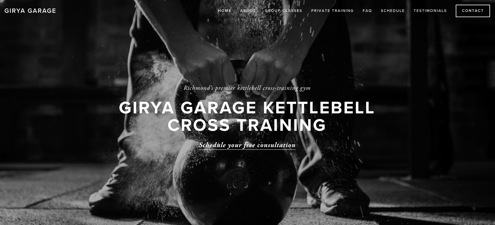
Normally, I would do a photoshoot – but I had no time, so I searched for a few appropriate stock photos (I only used 2 on the whole site). Now to be fair, this gym IS in a garage – and I didn’t want to be deceptive as to what the environment looked like. So when choosing stock imagery I was super mindful that the photo was representative of the experience. A little visual drama goes a long way. And I made sure to use some photos from their instagram feed on the home page and interior pages to show what the actual space looks like.
4. Make it clear what is offered.
The previous site had a bit of information overwhelm – there was technical content that might be overwhelming for the kettlebell newcomer. So instead of focusing on the specific techniques that are taught, I instead tweaked the copy to talk about what clients could expect when attending their first series of classes. In addition, the old site didn’t highlight personal training services – a key component of their business.
5. Clean it up – because looks matter.
This is something I see on a lot of sites. Everyone wants to put all their info all on one page. Facebook feed. Instagram feed. Links to people they like.
Why are your trying to take people AWAY from your website and distract them from what you have to offer? It’s hard enough to get people TO your site – why encourage them to go away?
And confusion leads to inaction.
The original site had way too much going on and was hard to read. Adding the new photos and using a clean template instantly transformed the site into a professional offering – and all the students who saw the new site were proud to be associated with it.
Takeaway? You can’t discount looks – you always want people to feel proud of sharing your site. Your site is the digital reflection of your business.
How’d it happen so fast?
1. I did it all at once with one quick planning meeting – there was no back and forth.
2. There’s nothing complex (yet) on the site like an e-mail capture form or payment system (this will come later).
3. I took copy from the old site and pared it down.
4. Limited imagery comes from stock and instagram feed.
A note on why I used SquareSpace instead of WordPress
For most online businesses, WordPress is going to be the smarter choice (and what I use for 95% of my work). In this case, I needed to get a simple site up fast – and a customized SquareSpace template was the quickest option (and I had to get them off of Wix which was really limiting what they could do). SquareSpace is a valid option if you just need a simple online presence with minimal pages (and you don’t need things like custom design, extensive blogging features or advanced SEO capabilities).
You don’t have a lot of control over the back-end of a SquareSpace site (unless you hire a developer), so you will be limited with what you can do with the site (and you won’t have the robust flexibility and potential of WordPress). However, for simple sites like this one, it can be a really smart, easy to get started choice. Plus you won’t have to worry about maintenance. I’ll be talking more about the pros and cons of using SquareSpace versus WordPress in future posts.
 Michelle Martello is a Kajabi and ConvertKit (Kit) expert, award-winning digital strategist, and founder of Minima Designs. She works with entrepreneurs and creators to launch, grow, and streamline their online businesses — from creating all kinds of digital products and programs to email marketing and automation. Michelle offers 1:1 strategy consults for anyone looking to simplify the tech and build a business that actually works (and lasts).
Your before and after is striking. What a phenomenal job you have done for them. I absolutely love your starting process, with concepts that will help marketing. Thanks for showing us your process 😀 Ive seen some prestigious design companies using squarespace. I havent tried it yet, but it looks like it produces good results. I normally use the divi theme for wordpress because its so easy to build. But having a template to work from when youre working fast probably makes all the different in the world. I love what youve done… KEEP SHARING!!!
Thank you so much Trisha! I always love behind-the-scenes myself – I’ll be sharing more of these soon!
Love your work and your communication style. Your posts are always chock full of fabulous advice and I always learn something key. Love the one page=one purpose idea. And you killed it with that opening photo.
xo
aw
Thank you Allyson! Isn’t it amazing what one photo can do? Changes everything!
Hi Michelle, I love this inside view!! And, your work is always beautiful, but so cool to see how you can whip something up quick too 🙂
Thank you so much for your kind words 🙂 Quick can be fun sometimes!