 As a designer, one of the things I create often are materials for marketing funnels. (A marketing funnel is all the steps or stages your prospective client or user takes on their buyer journey through conversion).
Recently I launched a new funnel for Elena Brower for her Essential Practice Cleanse.
Want to follow along? You can sign up for the whole series here.
How does a campaign come together?
First, determine your objective.
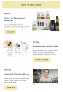
In this case, we wanted to promote a particular product – a cleanse kit – and we wanted to create materials to support buyers who purchased the kit.
Here are the items I knew I needed to create:
1. Landing Page – this is the page where users give their email address in exchange for more information about the offer.
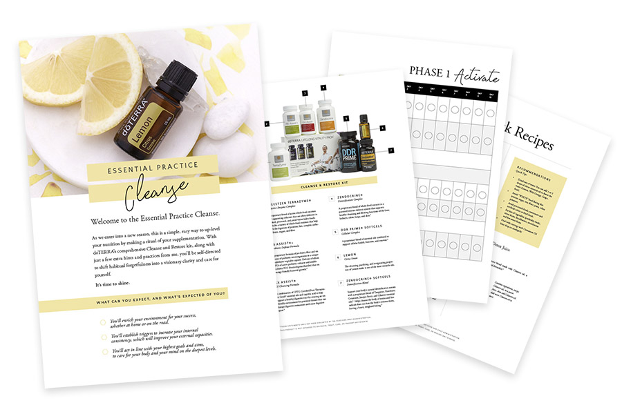
2. Opt-In Offer – This is the free content we’ll be giving our subscribers. In this case, we created a guidebook to help buyers use the kit and give them additional info and guidance.
3. Autoresponder Series – These are the series of emails the user will receive that serve to educate, inform and prompt the user to buy or take another desired action.
Note: You can create these items in any order – but I’ll often start with the item I’m giving away to subscribers since that design informs the look and feel for the rest of the materials.
(*Please note: Links with an * are affiliate links. I only recommend products that I use and trust myself).
Design your opt-in offer
If you’re giving away a downloadable, take your time to really craft something that people will use and benefit from. With every touchpoint you create you’re connecting with your audience – and whether they purchase now or later (or simply share your work with others), you want to give them the best experience of YOU possible. These offers are often one of the best things you can create for quality lead-generation.
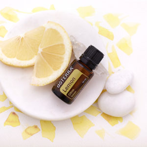
Pro tip #1: Choose a simple palette and one strong image
I started the design by selecting the great lemon image. This image then inspired the color palette for the campaign. I find if you stick to just one or two primary colors and fonts, you’ll end up with a more refined end product.
Pro tip #2: Use a template to get you started
If you want an easy way to create a printable (such as our PDF guidebook), I’m a big fan of modifying pre-made templates. Creative market* or Envato Elements* are great places to find Keynote, PowerPoint, Google Slides or InDesign templates to get you started – and you can save any of those templates as pdfs.
In this case, I started with a pre-made InDesign template initially intended for magazines. Then I “zhoosh” the rest of the document with other imagery, content and formatting. Not going to lie – those tables took some time to create (!) – but I really wanted to create something EASY for people to read and use. Really think about how someone will interact with your material.
Pro tip #3: Make it timeless
This will be an evergreen download – and I know thousands of people will use this tool. And we’re going to keep it up as long as the product is being offered. This is why although we’ll run “live” versions of the cleanse, I wanted to make the guidebook without mentioning any specific dates. Keeping materials “timeless” means you don’t have to update or remove content on a regular basis.
Pro tip #4: Design something once – and reuse it as much as possible!
You’ll notice I used the same header graphic and logo in all of the communications. This maintains design consistency (and makes your life easier!) Design it once – then extrapolate the design for use in your various materials. Keep in mind that most digital spaces (such as social media banners and newsletter headers) require horizontal orientation – so plan your design accordingly.
Design your landing page
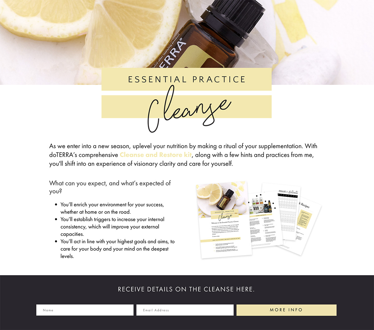
I’m a fan of keeping landing pages as simple as possible. Often I’ll remove any extraneous navigation such as headers and footers (and for sure I’ll remove any sidebars or other distractions). My goal is to get the user to take one action (typically to signup for the offer).
I used the Beaver Builder* plugin to create the page layout. (Click here for a quick tutorial on how to create a landing page using Beaver Builder*). This simple landing page outlines the offer and connects to our email autoresponder.
Pro tip #1: Make the URL easy to remember – in this case it’s elenabrower.com/cleanse.
Create your automation sequence
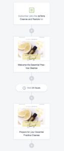
We’re using Campaign Monitor for this series (I love it for the ease of creating visual pleasing emails), but most any modern email marketing tool will allow you to create an autoresponder series. I personally use ConvertKit* for my own sequences and emails.
The first email gives the user the download we promised on the landing page as well as additional places to get support and guidance. A day later, a second email shares an educational video. Additional emails continue to support and educate the user.
Notice the yellow buttons? These are clear CTA (call to action) buttons to get the user to do something (like download guide, buy the kit or join the FaceBook group).
Pro tip #2: Don’t be afraid to repeat yourself
People miss emails or delete things by accident. I make sure to link out to the cleanse kit and the guidebook in every communication – that way I’m not making it hard for the user to find the info they need.
Test, launch and review
Make sure to go through every part of your funnel to verify everything is working as expected.
Test links and make sure users are getting your downloads.
Once you’ve gotten some traffic to go through your funnel, you’ll be able to review your data and analytics. You can then find out what (and when) people are clicking and buying. With that important information, you’ll be able to revise and refine your funnel.
Tools used to create this campaign
Beaver Builder* – WordPress plugin for page layout
Creative Market* – Graphic design templates
Envato Elements* – Graphic design templates
 Michelle Martello is a Kajabi and ConvertKit (Kit) expert, award-winning digital strategist, and founder of Minima Designs. She works with entrepreneurs and creators to launch, grow, and streamline their online businesses — from creating all kinds of digital products and programs to email marketing and automation. Michelle offers 1:1 strategy consults for anyone looking to simplify the tech and build a business that actually works (and lasts).
Excellent work, Michelle—as always.
If it’s helpful to anyone reading… I’m loving Kajabi to connect everything together. Like anything, there’s a small learning curve and pros/cons to the CMS… but their customer support is INCREDIBLE.
Gratefully #TeamMinima,
Tony
Yay! Cannot wait to see your creation!
Thank you for this Michelle. Came right on time!
So glad you liked it!