Here’s my dirty little design secret.
I cheat. A lot.
The hardest thing for a designer to face is a blank screen.
And the worst thing a client can say to me is “do whatever you want” with no guidance at all.
We all need some inspiration to start – and often we need something we can use to get started!
That’s why I rely on stock templates and premade layouts to inspire and support my custom work.
Here’s how I use the best stock photo and graphic design resources to make projects stand out.
- My favorite resource for stock design assets
- How to use stock templates to create custom work
- Using stock sites to find inspiration for social media graphics
- How to spend less time searching for the perfect stock resources
- Pro tips for creating custom graphics that look like your brand
- How to find unique background images for your website
Please note that I am an affiliate for some of the resources listed below. As an affiliate, I may earn a referral fee if you purchase these products based on my recommendations. I only recommend those services that I actually use in my own business.
My favorite resource for stock design assets
My very best resource is a monthly subscription to Envato Elements. I use this site almost every day to find professional templates for everything from ebooks to fonts to photos to slide presentations. It’s a seriously cheap stock subscription – at less than $18 a month I get access to millions of images, templates, fonts, icons and even audio samples and video files! With other stock sites I’d be lucky to spend that on just one photo.
How to use stock templates to create custom work
When I started creating the newest version of my Getting Paid Online Ebook, I turned to the ebook template section and started looking for inspiration. (Pro tip: also look at magazine layouts for more ebook template ideas).
Since it’s basically free for me to play, I’ll often download several different ebooks that have elements I like – and then I’ll create a new document with just the features I want to use. Sometimes I may only use one page from a 100 page ebook template – but that’s the beauty of the cheap stock subscription – I don’t feel guilty if I only use a small portion of it. It’s like tearing one page out of magazine to put on your vision board.
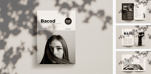
While I used InDesign to design and edit my ebook, you can totally use presentation slide templates (Keynote, Powerpoint or Google slides) to create your own ebook easily – just save it out as a PDF and you’re good to go!
Using stock sites to find inspiration for social media graphics
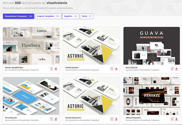
Want your social media feed to stand out? There are so many gorgeous templates out there now – but you have to know where to look. Click on the “graphic templates” section and use the word instagram or facebook in the search box – this will pull up perfectly sized image templates.
Then you can refine by the tool you’re using for editing (while the filter shows Adobe products like Photoshop or Illustrator – there are tons of Canva options as well – just make sure to read the product description to make sure it will work in Canva).
How to spend less time searching for the perfect stock resources
- Filter and refine
Let’s say you’re searching for a Keynote template to create slides for your next online course. Click on Presentation templates, then choose the application you’re using (in this case, it would be Keynote.) From there, start with sort by popular or new – you’ll see what’s trending now in terms of design.
- Look at the other keywords used on the image
Found an image that’s close, but not quite it? Look at the item tags at the bottom of the description to find alternative keywords – you may find they use terms you hadn’t even thought of! And you’ll also see similar templates shown at the bottom of the page. - Look at the author profile
Found a style you like – but you’re looking for more options? Each item will display more items from the same author – often designers will create multiple versions of graphics in similar styles. And in some cases, the author’s name and contact information will be listed so you can even contact them directly! I once had a custom font made by an artist that I found on a stock site.
Pro tips for creating custom graphics that look like your brand
When I designed Laura Belgray’s site talkingshrimp.com we knew we wanted a late 70s vibe. So I started searching “70s” for inspiration. Up popped a 70s text effect series of graphic illustrations. I was able to recolor the graphics and use them as the base template for the custom design – again, removing all the stuff I didn’t want to use and using just the elements that looked interesting. You don’t have to use the whole file – just use the parts that interest you! That’s the best aspect of these tools – they can inspire totally new designs because they give you something to start with.

How to find unique background images for your website
Adding full-width headers or background images is a great way to change up the look of your website fast. One of my favorite things to do is add subtle texture to break up page sections – most people only add photos and don’t consider other options that can really make their site stand out.

A few tricks up my sleeve to find subtle, ethereal background images – search for words like bokeh, watercolor, texture, cement, fiber, paper and abstract.

 Michelle Martello is a Kajabi and ConvertKit (Kit) expert, award-winning digital strategist, and founder of Minima Designs. She works with entrepreneurs and creators to launch, grow, and streamline their online businesses — from creating all kinds of digital products and programs to email marketing and automation. Michelle offers 1:1 strategy consults for anyone looking to simplify the tech and build a business that actually works (and lasts).
Leave a Reply